Colour is not just visual. It has temperature, weight, speed. A warm red moves forward. A cool blue recedes. But within blue — that single word covering an enormous territory — the differences are just as radical.
Cobalt feels aristocratic and slightly cold. Ultramarine is baroque, saturated, operatic. Prussian is dark and ancient, almost black at its deepest. And phthalo — phthalo is dangerous: the most powerful blue in the palette, capable of tinting every other colour you own if you are not careful.
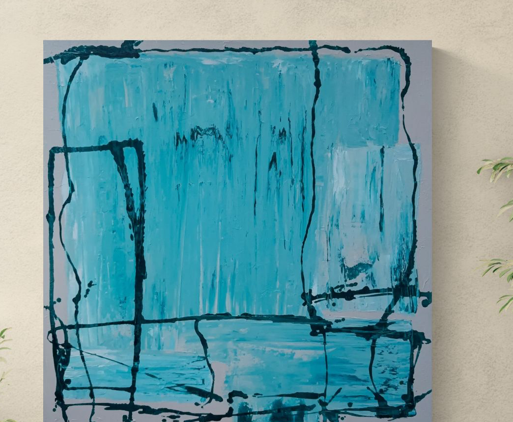
I have been looking for a specific blue for two years. Not cobalt's formality, not ultramarine's drama. Something quieter. Something that reads as blue without insisting on it. What I found, eventually, was a mixture: cerulean as the base, a whisper of phthalo to deepen and cool it, and a touch of ivory black — not to darken, but to take the edge off. To make it breathe.
Cerulean: the colour of particular skies
Cerulean is named for the sky — the Latin caelum — and it shows. It is a light, airy blue, the colour of the sky over a Mediterranean coast at ten in the morning, before the heat comes in. Alone, it can feel thin, even timid. It lacks conviction at the edges of a form.
But cerulean behaves extraordinarily well in mixture. It extends other blues without dominating them. Mixed with burnt sienna, it produces a grey of remarkable subtlety — warmer than a true grey, with a slight violet undertone that shifts depending on the light. This is the grey that appears in the lower register of The Rain Room, and it is, I think, the most important colour in that painting.
Phthalo: the pigment to use with caution
Phthalo blue — phthalocyanine — is a synthetic pigment developed in the 1930s, and it is one of the most staining, most tinting colours in existence. A tube of phthalo will outlast three tubes of any other blue because you use so little of it. A match-head-sized amount mixed into a large puddle of white will shift the whole puddle decisively toward blue.
I use phthalo the way I use salt: present in everything, visible in nothing. Its job is to make the other colours sing, not to sing itself.
In the cyan works — the series of paintings with their interlocking structures of cool blue and warm ground — phthalo is everywhere. But you would not know it to look at them. What you see is depth, a sense that the blue goes further back than the canvas should allow. That depth is phthalo's contribution.
On the paintings that come from a single obsession
The Rain Room started as an experiment. I had been mixing blues for two weeks — literally, without painting, just mixing and testing on small pieces of paper — when I made the combination that became the key note of the painting: cerulean, phthalo, ivory, a trace of raw umber. I looked at it for a long time. Then I went and started the painting.
Working in a single colour family forces a particular kind of attention. When you remove the distraction of colour contrast, you become aware of everything else: the texture of the mark, the weight of the paint, the direction of the brushstroke. You notice things you had not noticed before. The Rain Room is the most carefully considered painting I have made.
It is available in the catalogue. As are several studies from this period, if you are looking for something smaller in scale.